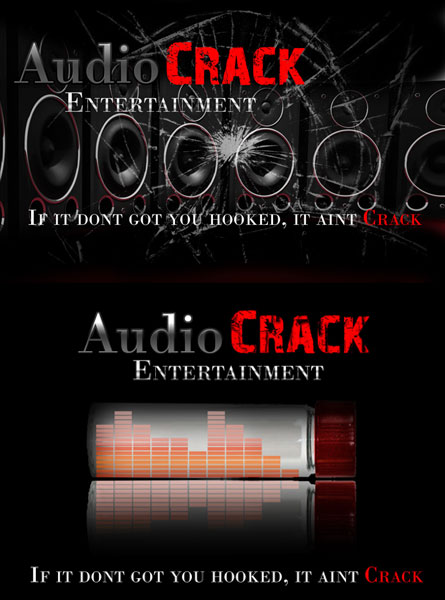
We were tasked to come up with a couple of concepts for Audio Crack Entertainment, a primarily hip-hop and R&B production company. These will be used across the print spectrum from clothing to magazines. Along with sample colors, we had conceptual input from the client. We used Photoshop along with a couple of vector graphics done in Illustrator. Here is what we came up with:


Powerful and excellent use of graphics and color.
‘Course, I’m about as target of your audience as would be a wolf in a sewing circle, so I won’t comment on the grammar. 🙂
Being the uncouth lout that I am, I *will* comment on the grammar “If it don’t got you hooked”?? I’m not a 20something hip hopper, but that doesn’t even make sense to me. But then maybe it isn’t supposed to. After all *I* listen to bluegrass and southern gospel, what I know about hip hop wouldn’t fill a crack pipe.
The graphics are great!
The first sample has too many small details (cracks and speakers) that make it look cluttered. But this is just my opinion, if the customer likes it, it’s perfectly OK 🙂
Being a 20something (though not really into hip-hop at all) I actually really like the slogan! It’s memorable and made me laugh…
Well there you go; it just takes someone in their target audience to decipher it.
BTW: I *really* appreciate the way you have your comment editor set up to display type that I don’t need a microscope to see what I’m typing.
Hi Rob
Firstly thanks for visiting my blog and taking the time to comment. Thought I would come check out your site. I like the graphics. Will email with some questions I have about my own site. Like Allan, I appreciate the large print for typing my comment too. Thanks
Patricia Perth Australia